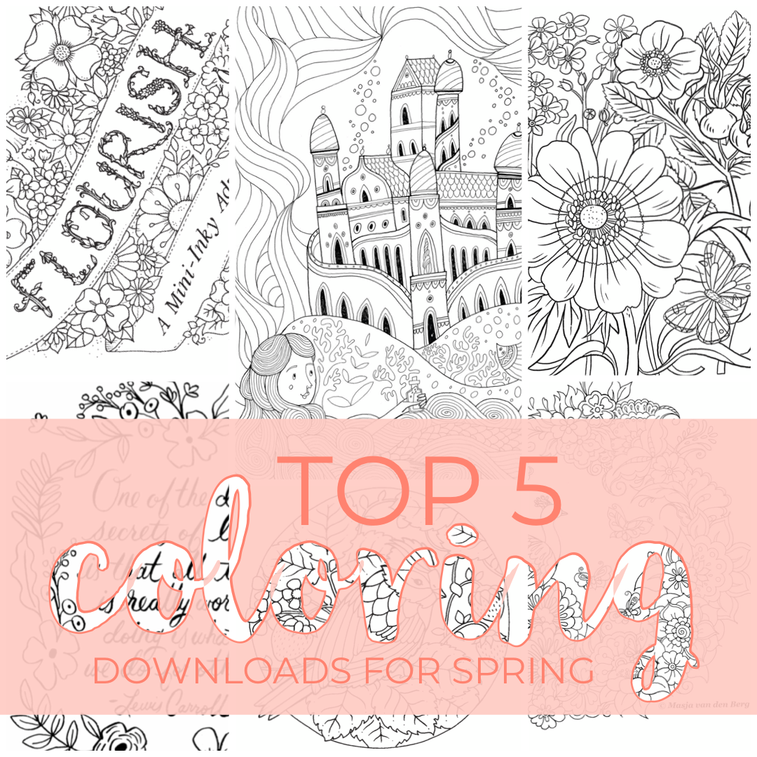
Top Five Spring Downloads
Hello! It’s been quite a while since I’ve made a post - I’m sure you’ve noticed. Haha! I thought I’d jump back into things with a little list of a few of the fun coloring downloads that are available right now. If you follow me on Instagram, then you’ve probably seen me repost about them in my stories, but I thought it’d be nice if they are listed in one convenient place. haha!

Eilidh Muldoon
Flourish | The queen of coloring books, Johanna Basford, has released a 12-page book for download. It is full of super cute little toadstool houses, bugs, flowers, and even a turtle!
Eilidh Muldoon | Even though she has a new baby at home, Eilidh Muldoon found time to draw a couple of awesome pages for us to color. It’s a departure from her architectural themed books (Check out this post about her books) - they have a bit of a fairytale feel. Castles, Mermaids. Such fun!
Masja van den Berg | Masja has created a beautiful peacock illustration for us to color! I highly recommend checking out the coloralong the amazing Evi (@e.m.c.p) put together for this spring. She’s posted so many wonderful versions of this illustration!
Oana Befort | She doesn’t have a coloring book that I’m aware of, but her illustrations and paintings are gorgeous! And don’t get me started on the paper goods! This wrapping paper is amazing!
Rifle Paper Co | Speaking of amazing paper goods, Rifle Paper has some of my very favorite stationery!! And they have created some fun cards and things you can download and color!
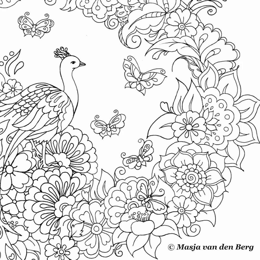
Masja van den Berg
And I have a few tips for printing:

Oana Befort
I recommend thinking about the kind of paper you like and the medium you plan to use. I like to use inky ink markers, so I usually print my pages on watercolor paper. Bristol works well for ink too; I just prefer a toothier surface. I would also imagine you’d want a bit of toothiness for colored pencils as well.
If you are able, I also highly recommend lightening the lines in Photoshop or something similar before you print. It really makes a difference if you like to white out the lines. I find that you can easily draw the lines back in, but trying to remove them is harder.
If you are in a place where sourcing specialty paper is a chore, there’s always plain printer paper. It’s not complicated or fussy, but it does a fair job - especially if you are using colored pencils. (I always want to call them map colors. Just me? Probably.) And there is something to be said for keeping things simple and stress-free.
All of the files above are of excellent quality, you just want to be sure you downloaded the file and not the preview. If you just zoom in like 2-300% and it’s still basically clear, then you’re good to print.
Most of these are PDF files, and the settings might be a bit wonky. I like to double-check the page is set to the right direction (portrait or landscape) and that you select “Fit to Page” or “Scale to Fit.”

Flourish | Johanna Basford
With all of the uncertainty in the world right now, it’s nice to know we can still tuck into some coloring with our favorite artists (even if we can’t always have new books delivered.) I hope you guys find some comfort and joy in coloring these and any other illustrations!!
Thank you do much to all the amazing artists that shared their work with us!!
Stay healthy and happy out there!! ❤️
**This post is not sponsored by these artists or their affiliates. I just really enjoy these things and want to share them with you.

Eilidh Muldoon: Illustrator of lovely things
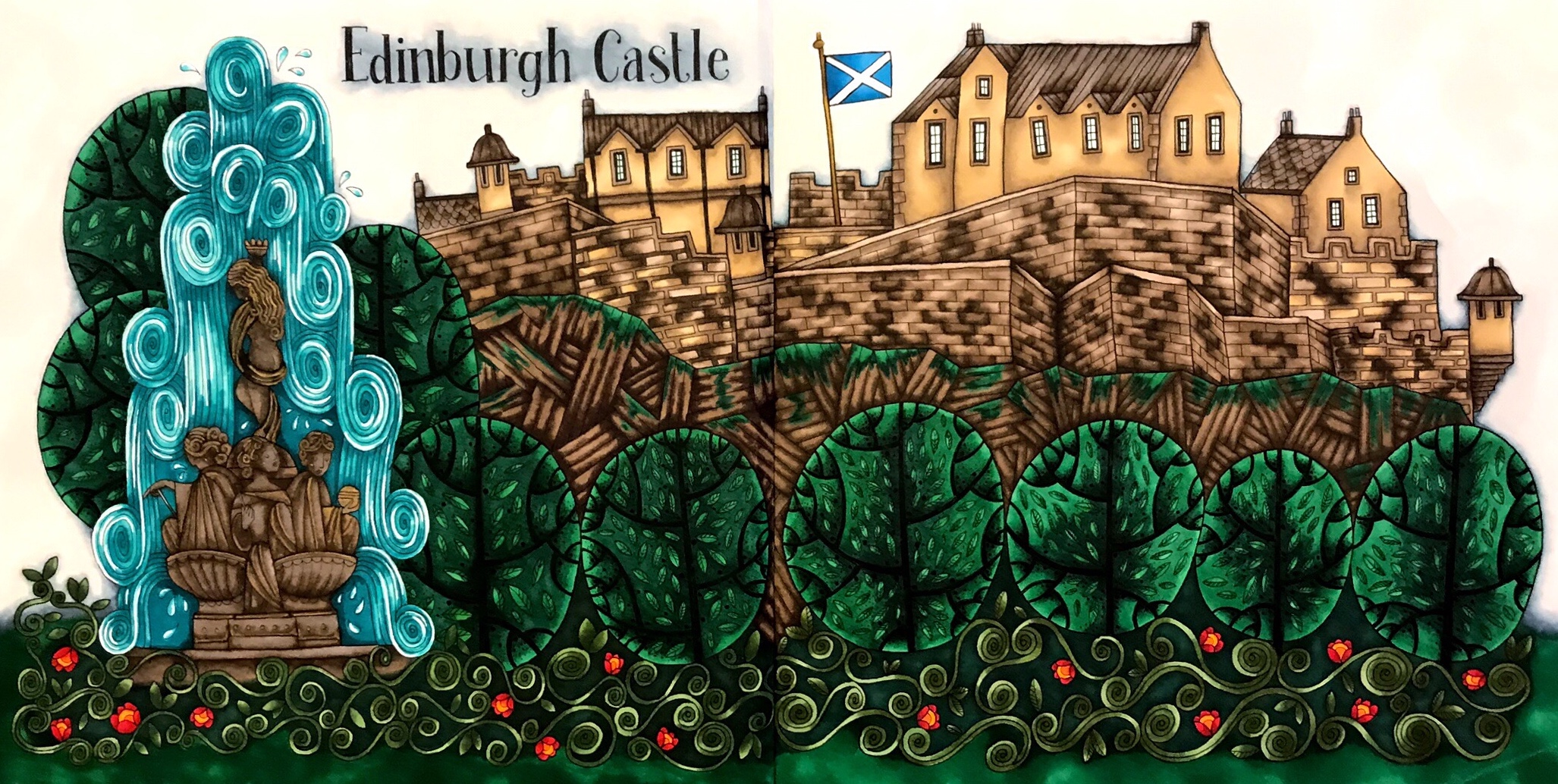
A few years ago my husband and I stumbled upon this lovely bookstore in Edinburgh, and I discovered Eilidh Muldoon. I have never posted a coloring from one of her books before today, but she is one of my favorite illustrators. I love her style and the way she gives you a cute little map of the area you are coloring. She also has several coloring books available - all with excellent paper texture!! I could honestly talk for days about the paper used in these books.

So, the reason you’ve never seen her books on my Instagram is that I’ve never actually colored in one before now. The sad truth is I have some coloring anxiety. I bought The Colouring Book of Edinburgh from a bookstore in Edinburgh (could it be more adorably perfect?) and I couldn’t risk ruining it. And I know the adult thing to do is give it a go and hope for the best. I thought about telling you guys I grew super brave and threw caution to the wind. But. I did not. For two years it sat on the shelf. (Full disclosure - I’m a nutter and it’s still sitting on the shelf.) BUT I did recently find the same book on Amazon (along with three others. How many coloring books can you own before you have a problem?) and thought I could try coloring in it instead. Haha! So far so good!!

I started at the beginning with Edinburgh Castle and Ross Fountain. It’s such a beautiful part of the city. I began with a bluer green and planned the rest from that point. There is just something to how green and alive everything is in Scotland. So amazing. Edinburgh Castle wall is dark in contrast to the bright greens of the garden. The juxtaposition is beautiful. I tried to keep that feeling within my coloring as well. And I added the bright red flowers for a fun little accent.
Eilidh’s books of Scotland are so much fun! AND to celebrate finally coloring Edinburgh, I am giving away a copy of The Colouring Book of Edinburgh along with a Prismacolor Premier 52 piece mixed coloring set. I am so excited to share this amazing book with all of you and hope you love it as much as I do.
To enter the giveaway all you have to do is follow me on Instagram and comment on this blog post with your Instagram user name. I’ll do a random drawing on the 28th of May.

Greenery: Shinhan BG51, G54 (267), G243 (226), G46 (112) Flowers: Shinhan R15 (126), Copic Y38 (108) Castle/Hill: Shinhan BR 99 (280), BR116 (178), BR115 Fountain: Warm Greys, Shinhan BR64 (156), B65 (154), BG174, Posca Gold & White — Faber Castell equivalencies in parentheses.
**This post is not sponsored by Prismacolor, Eilidh Muldoon, or their affiliates. I just really enjoy these things and want to share them with you.

Book: The Colouring Book of Edinburgh by Eilidh Muldoon
Supplies: Shinhan Art | Copic | Faber Castell | Prismacolor