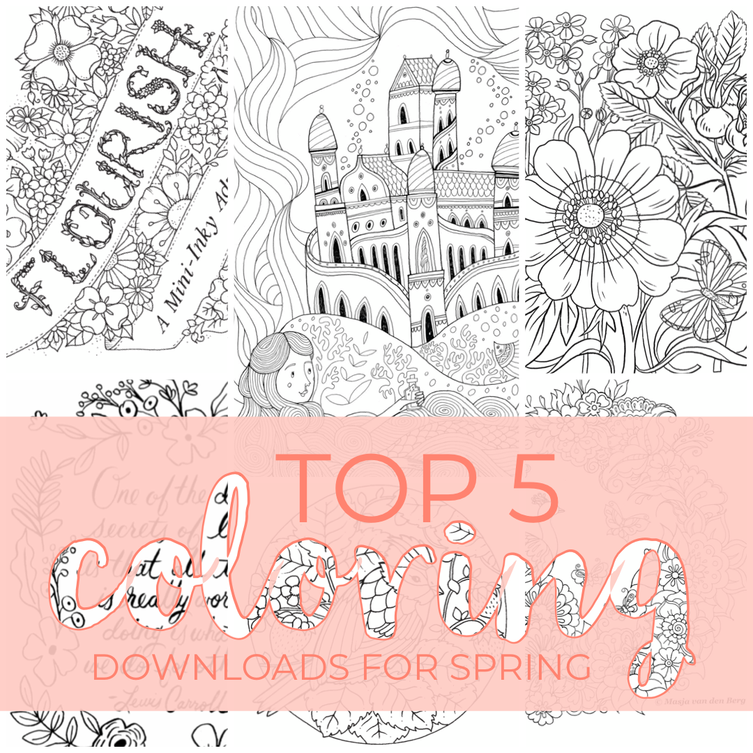
Top Five Spring Downloads
Hello! It’s been quite a while since I’ve made a post - I’m sure you’ve noticed. Haha! I thought I’d jump back into things with a little list of a few of the fun coloring downloads that are available right now. If you follow me on Instagram, then you’ve probably seen me repost about them in my stories, but I thought it’d be nice if they are listed in one convenient place. haha!

Eilidh Muldoon
Flourish | The queen of coloring books, Johanna Basford, has released a 12-page book for download. It is full of super cute little toadstool houses, bugs, flowers, and even a turtle!
Eilidh Muldoon | Even though she has a new baby at home, Eilidh Muldoon found time to draw a couple of awesome pages for us to color. It’s a departure from her architectural themed books (Check out this post about her books) - they have a bit of a fairytale feel. Castles, Mermaids. Such fun!
Masja van den Berg | Masja has created a beautiful peacock illustration for us to color! I highly recommend checking out the coloralong the amazing Evi (@e.m.c.p) put together for this spring. She’s posted so many wonderful versions of this illustration!
Oana Befort | She doesn’t have a coloring book that I’m aware of, but her illustrations and paintings are gorgeous! And don’t get me started on the paper goods! This wrapping paper is amazing!
Rifle Paper Co | Speaking of amazing paper goods, Rifle Paper has some of my very favorite stationery!! And they have created some fun cards and things you can download and color!
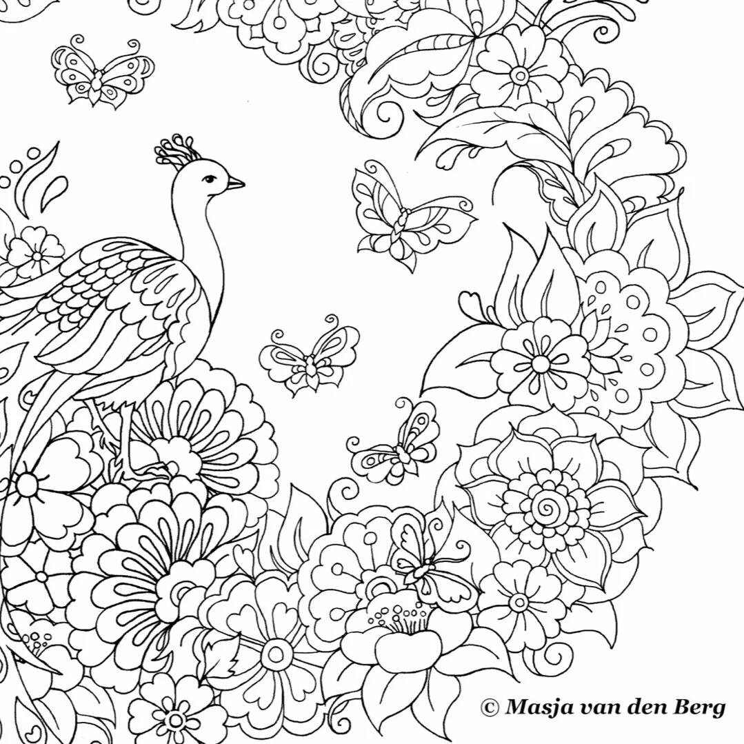
Masja van den Berg
And I have a few tips for printing:

Oana Befort
I recommend thinking about the kind of paper you like and the medium you plan to use. I like to use inky ink markers, so I usually print my pages on watercolor paper. Bristol works well for ink too; I just prefer a toothier surface. I would also imagine you’d want a bit of toothiness for colored pencils as well.
If you are able, I also highly recommend lightening the lines in Photoshop or something similar before you print. It really makes a difference if you like to white out the lines. I find that you can easily draw the lines back in, but trying to remove them is harder.
If you are in a place where sourcing specialty paper is a chore, there’s always plain printer paper. It’s not complicated or fussy, but it does a fair job - especially if you are using colored pencils. (I always want to call them map colors. Just me? Probably.) And there is something to be said for keeping things simple and stress-free.
All of the files above are of excellent quality, you just want to be sure you downloaded the file and not the preview. If you just zoom in like 2-300% and it’s still basically clear, then you’re good to print.
Most of these are PDF files, and the settings might be a bit wonky. I like to double-check the page is set to the right direction (portrait or landscape) and that you select “Fit to Page” or “Scale to Fit.”

Flourish | Johanna Basford
With all of the uncertainty in the world right now, it’s nice to know we can still tuck into some coloring with our favorite artists (even if we can’t always have new books delivered.) I hope you guys find some comfort and joy in coloring these and any other illustrations!!
Thank you do much to all the amazing artists that shared their work with us!!
Stay healthy and happy out there!! ❤️
**This post is not sponsored by these artists or their affiliates. I just really enjoy these things and want to share them with you.

April Color-Alongs
I am rather new to color-alongs. I always find out about them well after they are over. At first, I thought there was some club you had to join to know about these, but really it’s just a matter of paying attention. Haha! So, for my first real go at color-alongs, I’ve jumped in head first. There are so many great ones right now; it’s insane. I have greatly enjoyed coloring this month!!

Sky: Cool Greys 1-5 Cats: Shinhan Art BG61 (154), BG179 (156), P281 P85 Copic BG15 (155) Buildings: ShinHan Art Y225, BG61 (154), BG179 (156), YR33 (111) Copic Y38 (108), BG15 (155), YG97, YG95 Faber Castell equivalencies in parentheses.
I started April with an unconventional colors challenge from the Rita Berman Facebook group. We could choose any Rita Berman illustration we want, but color a bit of it in unnatural colors. I am not generally comfortable with using odd colors. I like to keep things reasonably natural. I was pretty unsure going into this, but it was so much fun!! I suggest everyone step outside their comfort zones and use some wacky colors.
Shortly after choosing the cats I found the #AprilShowersColoralong by @PixieProjects and this page fit right in. Two birds, one stone. I love a grey sky too. I know that is not really very Texan of me, but it’s true. I love grey skies.
Next, we have an Easter color-along, #EasterColors19 - @RekaColour first color-along. I, of course, went with some Easter eggs. I’ll be honest; I’ve been waiting for a time when I could color this page. The daffodils were calling my name. And those cute little butterflies and bird! What’s not to love?

Sky: Cool Grey 1-2 Bird: Shinhan Art BG61 (154), BG179 (156), YR33 (111) Copic Y38 (108), BG15 (155) Prisma PB33 Daffodils: ShinHan Art Y225, YR23, YR33 (111) Copic Y38 (108) Grass: ShinHan Art GY47 (266), GY48 Copic YG23(112) Prisma PB124 (166)
Also, there’s #AllEggsYouCanColor by @aksenovaalex and #AprilAnimals2019 by @My_World_Of_Colors_77
Last one. #FantasticaFaeandFairytales by @ColourandChatwithSammie. The idea of a snail carrying a proper little house on his back is adorable. I really appreciate the imaginative nature of a lot of Rita Berman’s illustrations. So great! I knew I wanted to do a green snail with orange accents. The exciting thing about coloring is that the same colors used in different ways give you a totally different finished page. I pretty much used the same colors on all 3 of these. Yellow greens, bright orange yellows, cool greys, and pinks.

Sky: Cool Grey 1-7 Snail: Shinhan Art YR33 (111) Y225 GY48 Copic Y38 (108) YG97 YG95

For the most part, it was exactly how I imagined. But, the little house I will admit was a mess. It started pink, but it didn’t work with the rest of the page, so I put aqua over it. That left me with a weird purple. SO I put some yellow over that, and we have an odd green. Haha! It works well enough. I guess. Haha!
I hope you enjoyed hearing about all of my color-alongs for this month and are enjoying coloring along!! Happy Coloring!!

Book: Mein Frühlings Spaziergang by Rita Berman
Supplies: Shinhan Art | Copic | Prismacolor | Faber Castell | Posca

Book: Die Welt unter dr Lupe - zu Lande by Rita Berman
Supplies: Shinhan Art | Copic | Prismacolor | Faber Castell | Posca