
April Color-Alongs
I am rather new to color-alongs. I always find out about them well after they are over. At first, I thought there was some club you had to join to know about these, but really it’s just a matter of paying attention. Haha! So, for my first real go at color-alongs, I’ve jumped in head first. There are so many great ones right now; it’s insane. I have greatly enjoyed coloring this month!!

Sky: Cool Greys 1-5 Cats: Shinhan Art BG61 (154), BG179 (156), P281 P85 Copic BG15 (155) Buildings: ShinHan Art Y225, BG61 (154), BG179 (156), YR33 (111) Copic Y38 (108), BG15 (155), YG97, YG95 Faber Castell equivalencies in parentheses.
I started April with an unconventional colors challenge from the Rita Berman Facebook group. We could choose any Rita Berman illustration we want, but color a bit of it in unnatural colors. I am not generally comfortable with using odd colors. I like to keep things reasonably natural. I was pretty unsure going into this, but it was so much fun!! I suggest everyone step outside their comfort zones and use some wacky colors.
Shortly after choosing the cats I found the #AprilShowersColoralong by @PixieProjects and this page fit right in. Two birds, one stone. I love a grey sky too. I know that is not really very Texan of me, but it’s true. I love grey skies.
Next, we have an Easter color-along, #EasterColors19 - @RekaColour first color-along. I, of course, went with some Easter eggs. I’ll be honest; I’ve been waiting for a time when I could color this page. The daffodils were calling my name. And those cute little butterflies and bird! What’s not to love?

Sky: Cool Grey 1-2 Bird: Shinhan Art BG61 (154), BG179 (156), YR33 (111) Copic Y38 (108), BG15 (155) Prisma PB33 Daffodils: ShinHan Art Y225, YR23, YR33 (111) Copic Y38 (108) Grass: ShinHan Art GY47 (266), GY48 Copic YG23(112) Prisma PB124 (166)
Also, there’s #AllEggsYouCanColor by @aksenovaalex and #AprilAnimals2019 by @My_World_Of_Colors_77
Last one. #FantasticaFaeandFairytales by @ColourandChatwithSammie. The idea of a snail carrying a proper little house on his back is adorable. I really appreciate the imaginative nature of a lot of Rita Berman’s illustrations. So great! I knew I wanted to do a green snail with orange accents. The exciting thing about coloring is that the same colors used in different ways give you a totally different finished page. I pretty much used the same colors on all 3 of these. Yellow greens, bright orange yellows, cool greys, and pinks.

Sky: Cool Grey 1-7 Snail: Shinhan Art YR33 (111) Y225 GY48 Copic Y38 (108) YG97 YG95

For the most part, it was exactly how I imagined. But, the little house I will admit was a mess. It started pink, but it didn’t work with the rest of the page, so I put aqua over it. That left me with a weird purple. SO I put some yellow over that, and we have an odd green. Haha! It works well enough. I guess. Haha!
I hope you enjoyed hearing about all of my color-alongs for this month and are enjoying coloring along!! Happy Coloring!!

Book: Mein Frühlings Spaziergang by Rita Berman
Supplies: Shinhan Art | Copic | Prismacolor | Faber Castell | Posca

Book: Die Welt unter dr Lupe - zu Lande by Rita Berman
Supplies: Shinhan Art | Copic | Prismacolor | Faber Castell | Posca

Spring
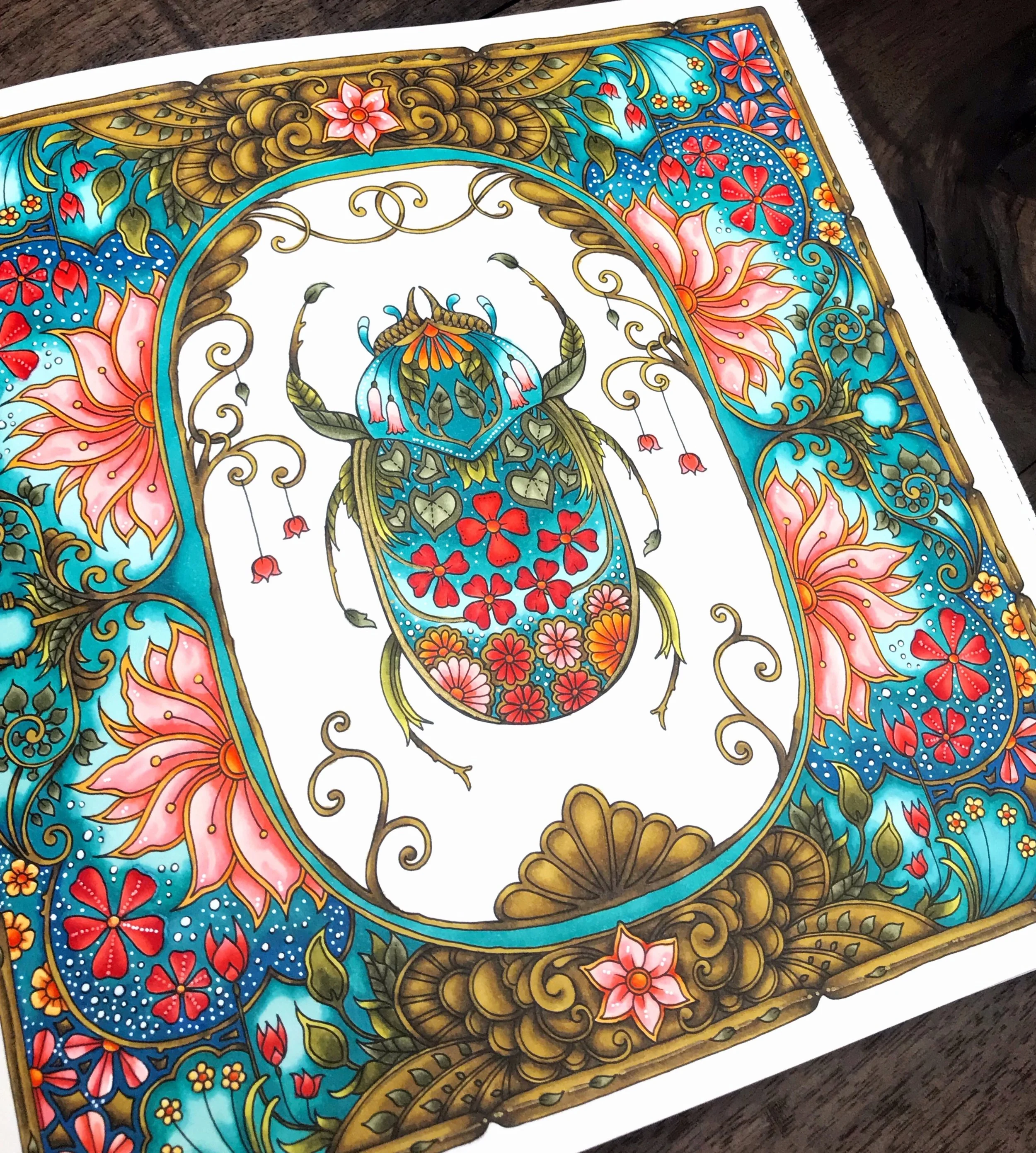
I’m going to let you guys in on a little not-so-secret secret. I love flowers. All of my colorings have flowers in them. For this one, I chose a very springy (as in the season, not the texture) page from World of Flowers. The cute little beetle, the fantastic frame. I love it all!

Going into this I knew one thing. The frame was going to be gold. Usually, I start my color choices with what greens I want to use. I could probably write a whole post on greens. (I might. Please try to fain excitement at the thought. Haha!) But this time I started with gold.

I get a lot of questions about how I color the gold bits. I think the key is color and expectation. I don’t readily know what colors I could use that would create a new, shiny gold, so I always aim for an antique gold with a bit of aged patina. It sounds weird, but to do that I used a mixture of greens and browns. I color with alcohol markers as opposed to pencils, but I have a set of Polychromos and will do my best to give some equivalencies. For my golds, I used Shinhan Art Y41 Olive Green, BR100 Walnut, and BR99 Bronze. In Faber Castell, I would use 268 Gold Green, 179 Bistre, and 177 Dark Walnut. I use the darkest brown (BR99) sparingly. Most of it is a blend of the two lighter colors. Blending is essential, especially with inks.
For the other dominant color, I went with shades of blue-green (Copic BG09, ShinHan B65 &B263.) I also really like the pop a white pen gives you on a dark background, and that was the motivator for a lot of my color choices on this one. I really enjoy deep, vibrant colors with a pop of brightness.
You might also notice as we go along that I love coral. And any time you see a coloring that doesn’t have coral in it, there was a real emotional struggle about it behind the scenes. Haha! Do you guys have any colors you want to use on every page?

Book: World of Flowers by Johanna Basford
Supplies: Shinhan Art | Copic | Prismacolor | Faber Castell | Posca