Spring
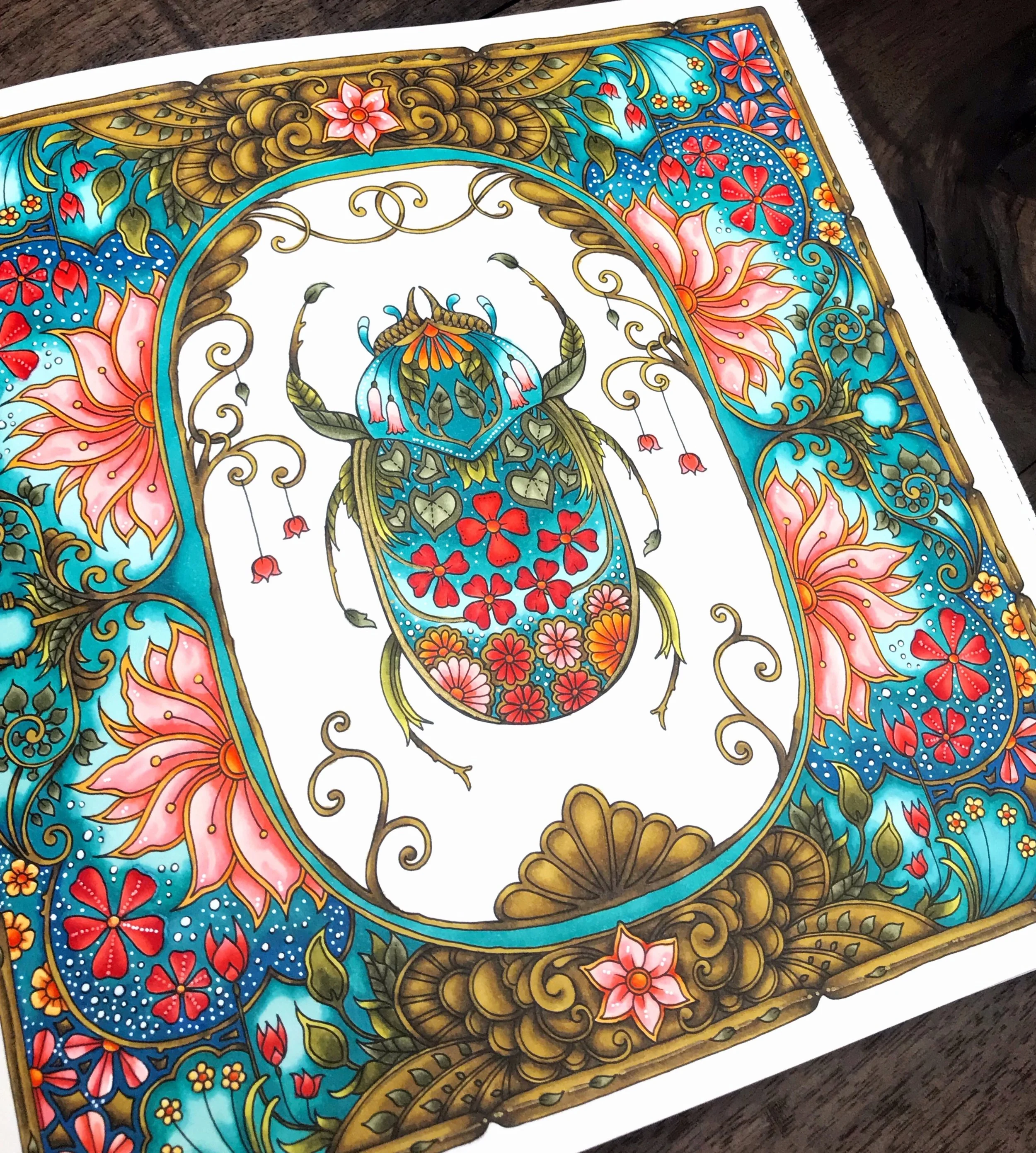
I’m going to let you guys in on a little not-so-secret secret. I love flowers. All of my colorings have flowers in them. For this one, I chose a very springy (as in the season, not the texture) page from World of Flowers. The cute little beetle, the fantastic frame. I love it all!

Going into this I knew one thing. The frame was going to be gold. Usually, I start my color choices with what greens I want to use. I could probably write a whole post on greens. (I might. Please try to fain excitement at the thought. Haha!) But this time I started with gold.

I get a lot of questions about how I color the gold bits. I think the key is color and expectation. I don’t readily know what colors I could use that would create a new, shiny gold, so I always aim for an antique gold with a bit of aged patina. It sounds weird, but to do that I used a mixture of greens and browns. I color with alcohol markers as opposed to pencils, but I have a set of Polychromos and will do my best to give some equivalencies. For my golds, I used Shinhan Art Y41 Olive Green, BR100 Walnut, and BR99 Bronze. In Faber Castell, I would use 268 Gold Green, 179 Bistre, and 177 Dark Walnut. I use the darkest brown (BR99) sparingly. Most of it is a blend of the two lighter colors. Blending is essential, especially with inks.
For the other dominant color, I went with shades of blue-green (Copic BG09, ShinHan B65 &B263.) I also really like the pop a white pen gives you on a dark background, and that was the motivator for a lot of my color choices on this one. I really enjoy deep, vibrant colors with a pop of brightness.
You might also notice as we go along that I love coral. And any time you see a coloring that doesn’t have coral in it, there was a real emotional struggle about it behind the scenes. Haha! Do you guys have any colors you want to use on every page?

Book: World of Flowers by Johanna Basford
Supplies: Shinhan Art | Copic | Prismacolor | Faber Castell | Posca