
Eilidh Muldoon: Illustrator of lovely things
A few years ago my husband and I stumbled upon this lovely bookstore in Edinburgh, and I discovered Eilidh Muldoon. I have never posted a coloring from one of her books before today, but she is one of my favorite illustrators. I love her style and the way she gives you a cute little map of the area you are coloring. She also has several coloring books available - all with excellent paper texture!! I could honestly talk for days about the paper used in these books.

So, the reason you’ve never seen her books on my Instagram is that I’ve never actually colored in one before now. The sad truth is I have some coloring anxiety. I bought The Colouring Book of Edinburgh from a bookstore in Edinburgh (could it be more adorably perfect?) and I couldn’t risk ruining it. And I know the adult thing to do is give it a go and hope for the best. I thought about telling you guys I grew super brave and threw caution to the wind. But. I did not. For two years it sat on the shelf. (Full disclosure - I’m a nutter and it’s still sitting on the shelf.) BUT I did recently find the same book on Amazon (along with three others. How many coloring books can you own before you have a problem?) and thought I could try coloring in it instead. Haha! So far so good!!

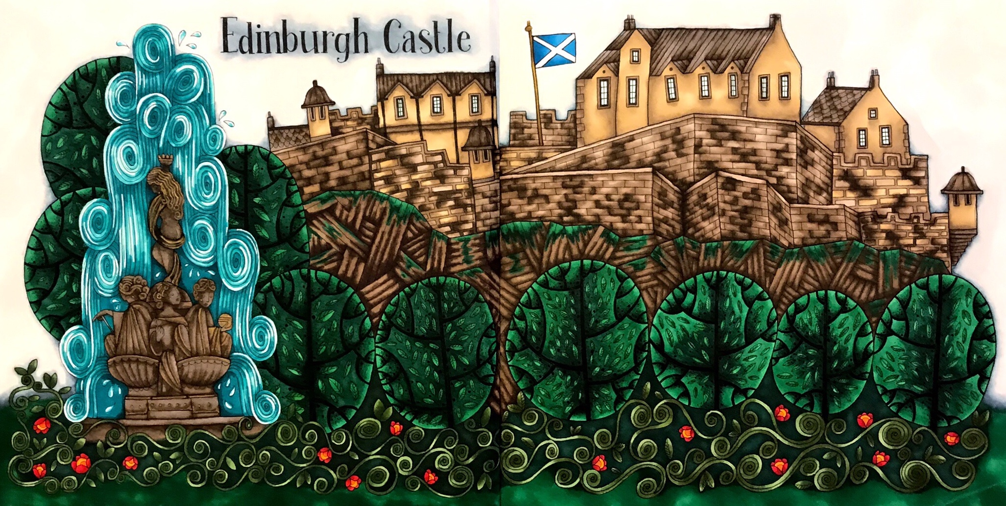
I started at the beginning with Edinburgh Castle and Ross Fountain. It’s such a beautiful part of the city. I began with a bluer green and planned the rest from that point. There is just something to how green and alive everything is in Scotland. So amazing. Edinburgh Castle wall is dark in contrast to the bright greens of the garden. The juxtaposition is beautiful. I tried to keep that feeling within my coloring as well. And I added the bright red flowers for a fun little accent.
Eilidh’s books of Scotland are so much fun! AND to celebrate finally coloring Edinburgh, I am giving away a copy of The Colouring Book of Edinburgh along with a Prismacolor Premier 52 piece mixed coloring set. I am so excited to share this amazing book with all of you and hope you love it as much as I do.
To enter the giveaway all you have to do is follow me on Instagram and comment on this blog post with your Instagram user name. I’ll do a random drawing on the 28th of May.

Greenery: Shinhan BG51, G54 (267), G243 (226), G46 (112) Flowers: Shinhan R15 (126), Copic Y38 (108) Castle/Hill: Shinhan BR 99 (280), BR116 (178), BR115 Fountain: Warm Greys, Shinhan BR64 (156), B65 (154), BG174, Posca Gold & White — Faber Castell equivalencies in parentheses.
**This post is not sponsored by Prismacolor, Eilidh Muldoon, or their affiliates. I just really enjoy these things and want to share them with you.

Book: The Colouring Book of Edinburgh by Eilidh Muldoon
Supplies: Shinhan Art | Copic | Faber Castell | Prismacolor

April Color-Alongs
I am rather new to color-alongs. I always find out about them well after they are over. At first, I thought there was some club you had to join to know about these, but really it’s just a matter of paying attention. Haha! So, for my first real go at color-alongs, I’ve jumped in head first. There are so many great ones right now; it’s insane. I have greatly enjoyed coloring this month!!

Sky: Cool Greys 1-5 Cats: Shinhan Art BG61 (154), BG179 (156), P281 P85 Copic BG15 (155) Buildings: ShinHan Art Y225, BG61 (154), BG179 (156), YR33 (111) Copic Y38 (108), BG15 (155), YG97, YG95 Faber Castell equivalencies in parentheses.
I started April with an unconventional colors challenge from the Rita Berman Facebook group. We could choose any Rita Berman illustration we want, but color a bit of it in unnatural colors. I am not generally comfortable with using odd colors. I like to keep things reasonably natural. I was pretty unsure going into this, but it was so much fun!! I suggest everyone step outside their comfort zones and use some wacky colors.
Shortly after choosing the cats I found the #AprilShowersColoralong by @PixieProjects and this page fit right in. Two birds, one stone. I love a grey sky too. I know that is not really very Texan of me, but it’s true. I love grey skies.
Next, we have an Easter color-along, #EasterColors19 - @RekaColour first color-along. I, of course, went with some Easter eggs. I’ll be honest; I’ve been waiting for a time when I could color this page. The daffodils were calling my name. And those cute little butterflies and bird! What’s not to love?

Sky: Cool Grey 1-2 Bird: Shinhan Art BG61 (154), BG179 (156), YR33 (111) Copic Y38 (108), BG15 (155) Prisma PB33 Daffodils: ShinHan Art Y225, YR23, YR33 (111) Copic Y38 (108) Grass: ShinHan Art GY47 (266), GY48 Copic YG23(112) Prisma PB124 (166)
Also, there’s #AllEggsYouCanColor by @aksenovaalex and #AprilAnimals2019 by @My_World_Of_Colors_77
Last one. #FantasticaFaeandFairytales by @ColourandChatwithSammie. The idea of a snail carrying a proper little house on his back is adorable. I really appreciate the imaginative nature of a lot of Rita Berman’s illustrations. So great! I knew I wanted to do a green snail with orange accents. The exciting thing about coloring is that the same colors used in different ways give you a totally different finished page. I pretty much used the same colors on all 3 of these. Yellow greens, bright orange yellows, cool greys, and pinks.

Sky: Cool Grey 1-7 Snail: Shinhan Art YR33 (111) Y225 GY48 Copic Y38 (108) YG97 YG95

For the most part, it was exactly how I imagined. But, the little house I will admit was a mess. It started pink, but it didn’t work with the rest of the page, so I put aqua over it. That left me with a weird purple. SO I put some yellow over that, and we have an odd green. Haha! It works well enough. I guess. Haha!
I hope you enjoyed hearing about all of my color-alongs for this month and are enjoying coloring along!! Happy Coloring!!

Book: Mein Frühlings Spaziergang by Rita Berman
Supplies: Shinhan Art | Copic | Prismacolor | Faber Castell | Posca

Book: Die Welt unter dr Lupe - zu Lande by Rita Berman
Supplies: Shinhan Art | Copic | Prismacolor | Faber Castell | Posca

Spring
I’m going to let you guys in on a little not-so-secret secret. I love flowers. All of my colorings have flowers in them. For this one, I chose a very springy (as in the season, not the texture) page from World of Flowers. The cute little beetle, the fantastic frame. I love it all!

Going into this I knew one thing. The frame was going to be gold. Usually, I start my color choices with what greens I want to use. I could probably write a whole post on greens. (I might. Please try to fain excitement at the thought. Haha!) But this time I started with gold.

I get a lot of questions about how I color the gold bits. I think the key is color and expectation. I don’t readily know what colors I could use that would create a new, shiny gold, so I always aim for an antique gold with a bit of aged patina. It sounds weird, but to do that I used a mixture of greens and browns. I color with alcohol markers as opposed to pencils, but I have a set of Polychromos and will do my best to give some equivalencies. For my golds, I used Shinhan Art Y41 Olive Green, BR100 Walnut, and BR99 Bronze. In Faber Castell, I would use 268 Gold Green, 179 Bistre, and 177 Dark Walnut. I use the darkest brown (BR99) sparingly. Most of it is a blend of the two lighter colors. Blending is essential, especially with inks.
For the other dominant color, I went with shades of blue-green (Copic BG09, ShinHan B65 &B263.) I also really like the pop a white pen gives you on a dark background, and that was the motivator for a lot of my color choices on this one. I really enjoy deep, vibrant colors with a pop of brightness.
You might also notice as we go along that I love coral. And any time you see a coloring that doesn’t have coral in it, there was a real emotional struggle about it behind the scenes. Haha! Do you guys have any colors you want to use on every page?
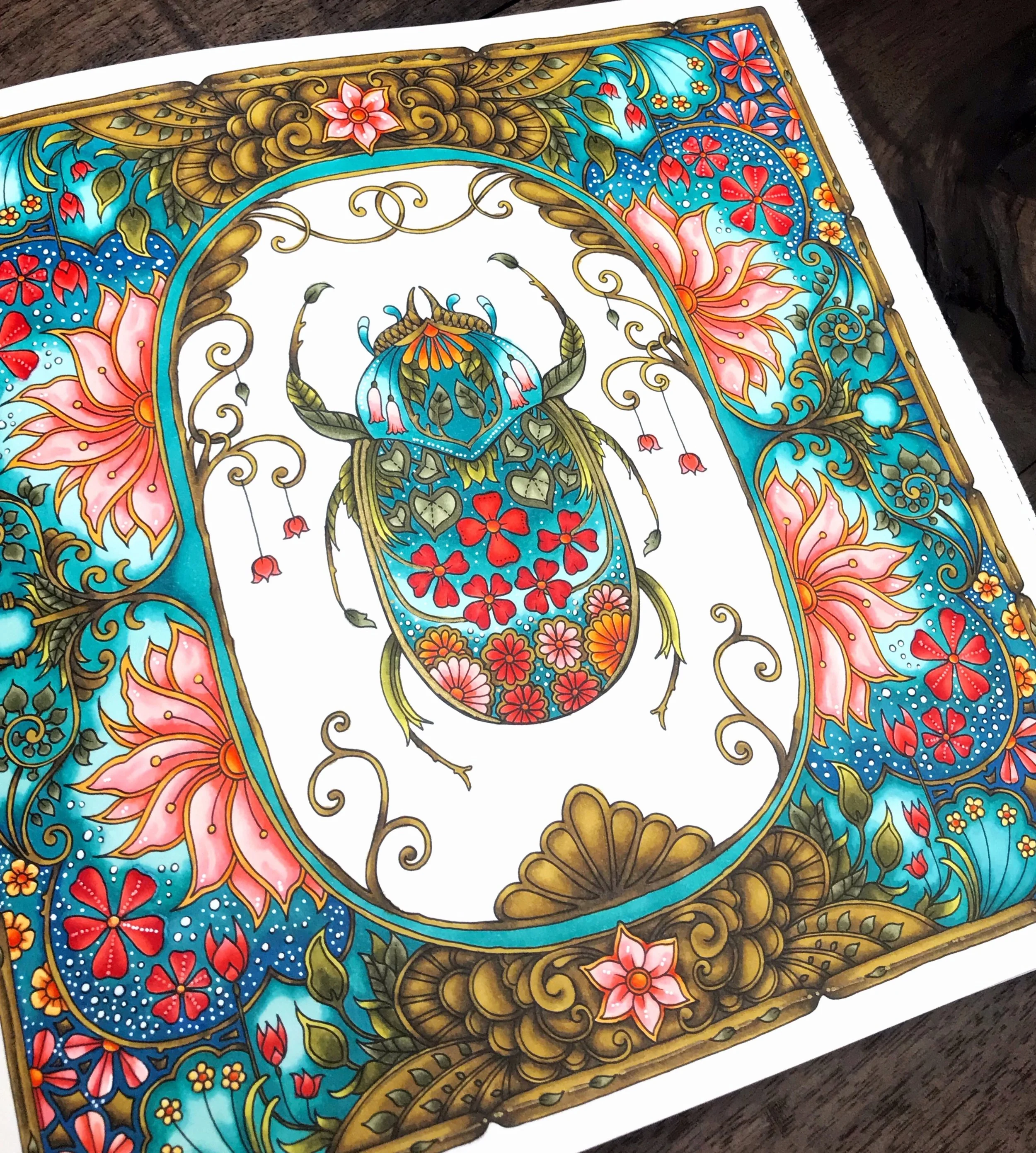

Book: World of Flowers by Johanna Basford
Supplies: Shinhan Art | Copic | Prismacolor | Faber Castell | Posca
Hello.
Welcome to Amber Loves Coloring - a coloring blog. I am Amber, and I very much love coloring. In 2016 I stumbled upon Enchanted Forest by Johanna Basford and have been obsessed ever since. Coloring has been the creative outlet I need to combat the stresses of adulting; and has become my go-to activity for good days and bad.
I absolutely adore our Instagram & Facebook community, so I thought it would be fun to start a blog about all of my favorite coloring things. I am super excited to share with you what I know and love, and learn as much as I can from all of you!! The coloring community is full of amazing people, and I couldn’t be more proud to be part of it!!
Happy Coloring!!
