
Progress: A Coloring Story
Five years ago, I discovered Johanna Basford’s Enchanted Forest, and it was so wonderful. I was so excited and proud of my coloring! And you know what, I still am!! So, today I’m going to share it with you guys, along with 2 other versions of the same page. (Yes, I do have 3 copies of Enchanted Forest. haha!)
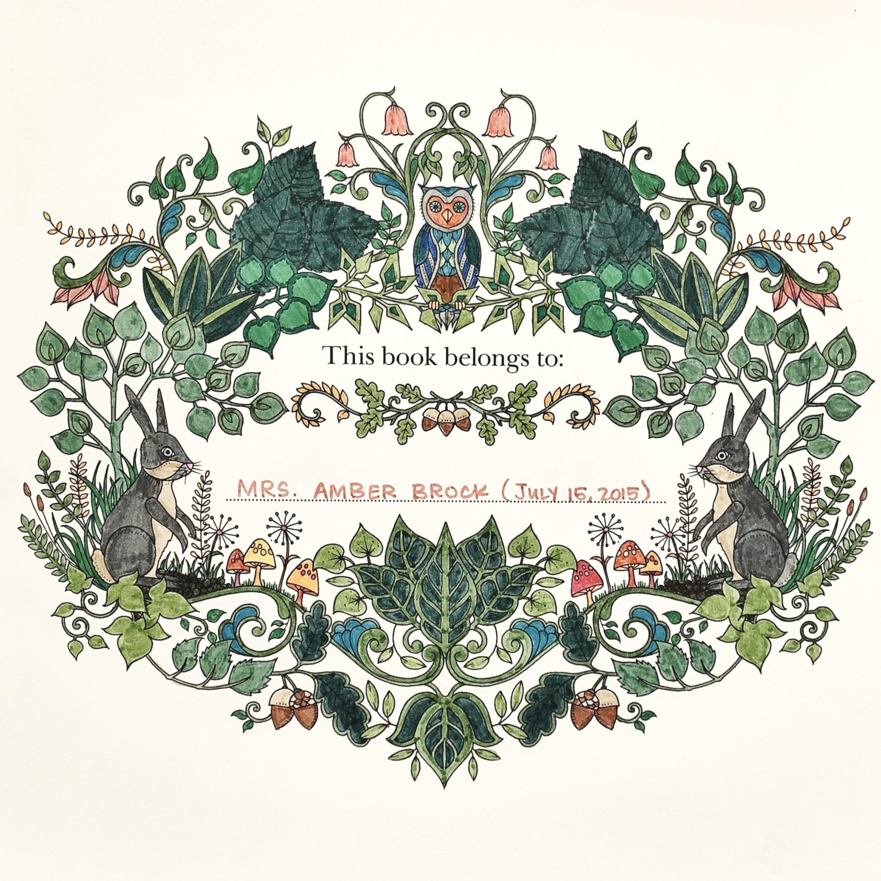

Many of you have messaged me about your colorings and how they aren’t “as good as mine” or how you wish you were “more creative.” And I get it. When I scroll through Instagram, it can be a little intimidating. I’m over here hobbling along with my markers, and Irena (@black_aneri) is doing artistical magic on every post. haha!
But, I always remind myself that practice means progress. Seeing my first coloring again really drove that concept home for me. It gives me a bit more appreciation for my colorings. I started here, with my 20 count Crayola Markers. And I loved every second!! Hopefully, it’ll help you guys when you compare your colorings to mine (or anyone else’s, for that matter.)
My skills have evolved over the years through practice and yours will too. Every coloring isn’t a winner, but every coloring leaves me feeling like a winner. If that makes sense? For me it’s about the joy of coloring and not always the finished product.
I mean let’s be honest, I love ending up with a beautiful coloring but sometimes I get a hot mess. haha! And because of that, I think it’s good to keep in mind that we all start somewhere. And we all have different styles. And we all keep practicing. And I’m pretty thankful that this is one of those things where the practice is the most fun bit!!
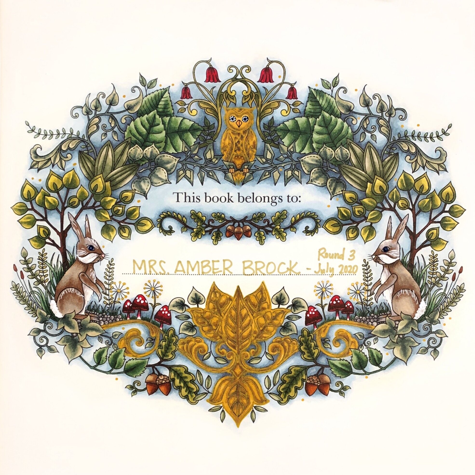
Stay happy and safe out there! And keep coloring - just for the fun of it!! Even when you know it’s going in a really questionable direction. haha!

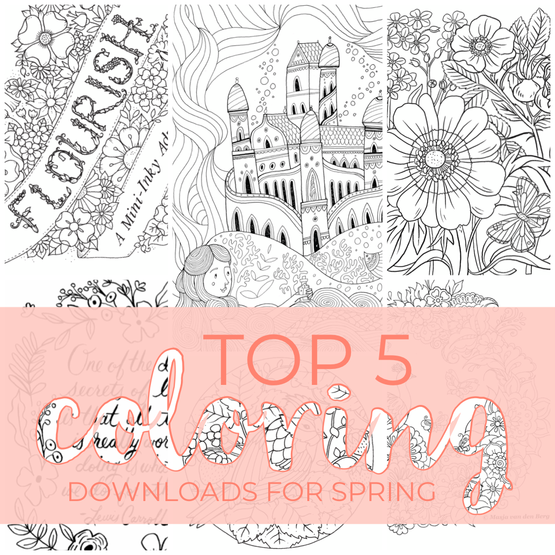
Top Five Spring Downloads
Hello! It’s been quite a while since I’ve made a post - I’m sure you’ve noticed. Haha! I thought I’d jump back into things with a little list of a few of the fun coloring downloads that are available right now. If you follow me on Instagram, then you’ve probably seen me repost about them in my stories, but I thought it’d be nice if they are listed in one convenient place. haha!

Eilidh Muldoon
Flourish | The queen of coloring books, Johanna Basford, has released a 12-page book for download. It is full of super cute little toadstool houses, bugs, flowers, and even a turtle!
Eilidh Muldoon | Even though she has a new baby at home, Eilidh Muldoon found time to draw a couple of awesome pages for us to color. It’s a departure from her architectural themed books (Check out this post about her books) - they have a bit of a fairytale feel. Castles, Mermaids. Such fun!
Masja van den Berg | Masja has created a beautiful peacock illustration for us to color! I highly recommend checking out the coloralong the amazing Evi (@e.m.c.p) put together for this spring. She’s posted so many wonderful versions of this illustration!
Oana Befort | She doesn’t have a coloring book that I’m aware of, but her illustrations and paintings are gorgeous! And don’t get me started on the paper goods! This wrapping paper is amazing!
Rifle Paper Co | Speaking of amazing paper goods, Rifle Paper has some of my very favorite stationery!! And they have created some fun cards and things you can download and color!
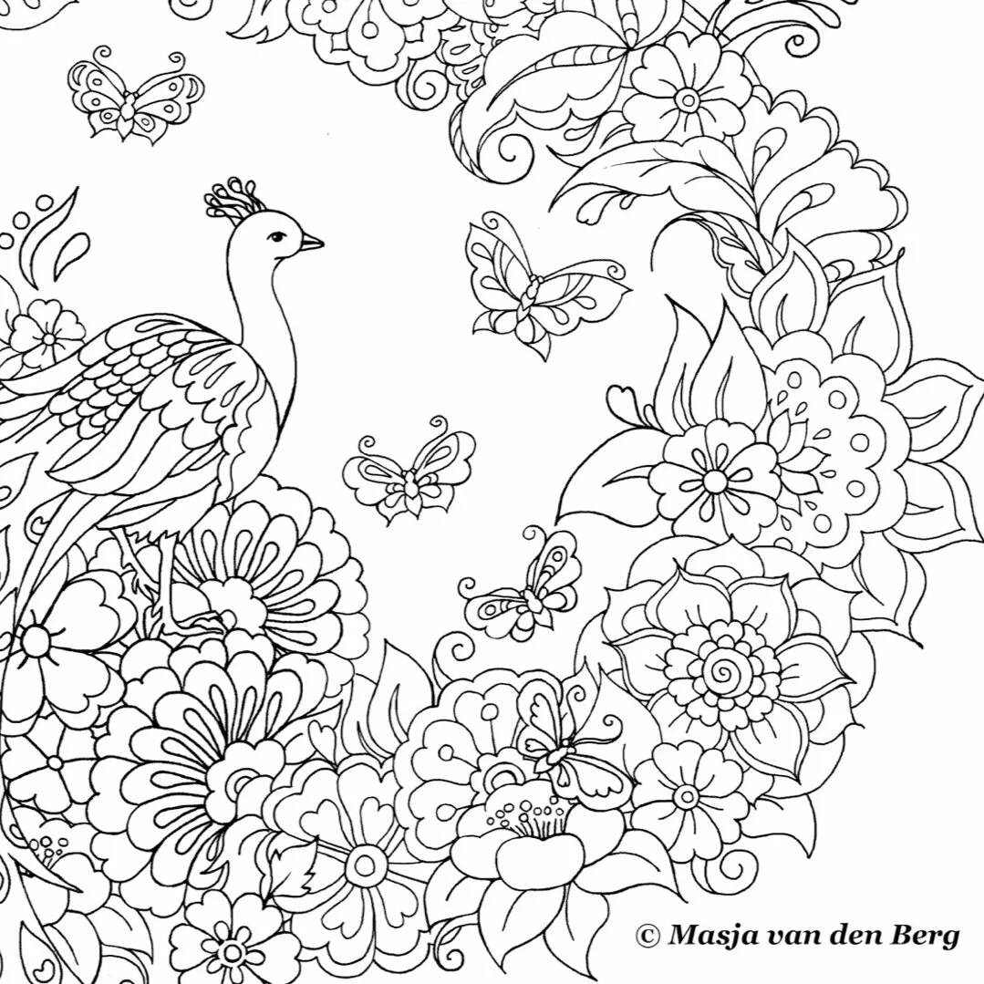
Masja van den Berg
And I have a few tips for printing:

Oana Befort
I recommend thinking about the kind of paper you like and the medium you plan to use. I like to use inky ink markers, so I usually print my pages on watercolor paper. Bristol works well for ink too; I just prefer a toothier surface. I would also imagine you’d want a bit of toothiness for colored pencils as well.
If you are able, I also highly recommend lightening the lines in Photoshop or something similar before you print. It really makes a difference if you like to white out the lines. I find that you can easily draw the lines back in, but trying to remove them is harder.
If you are in a place where sourcing specialty paper is a chore, there’s always plain printer paper. It’s not complicated or fussy, but it does a fair job - especially if you are using colored pencils. (I always want to call them map colors. Just me? Probably.) And there is something to be said for keeping things simple and stress-free.
All of the files above are of excellent quality, you just want to be sure you downloaded the file and not the preview. If you just zoom in like 2-300% and it’s still basically clear, then you’re good to print.
Most of these are PDF files, and the settings might be a bit wonky. I like to double-check the page is set to the right direction (portrait or landscape) and that you select “Fit to Page” or “Scale to Fit.”

Flourish | Johanna Basford
With all of the uncertainty in the world right now, it’s nice to know we can still tuck into some coloring with our favorite artists (even if we can’t always have new books delivered.) I hope you guys find some comfort and joy in coloring these and any other illustrations!!
Thank you do much to all the amazing artists that shared their work with us!!
Stay healthy and happy out there!! ❤️
**This post is not sponsored by these artists or their affiliates. I just really enjoy these things and want to share them with you.

Spring
I’m going to let you guys in on a little not-so-secret secret. I love flowers. All of my colorings have flowers in them. For this one, I chose a very springy (as in the season, not the texture) page from World of Flowers. The cute little beetle, the fantastic frame. I love it all!

Going into this I knew one thing. The frame was going to be gold. Usually, I start my color choices with what greens I want to use. I could probably write a whole post on greens. (I might. Please try to fain excitement at the thought. Haha!) But this time I started with gold.

I get a lot of questions about how I color the gold bits. I think the key is color and expectation. I don’t readily know what colors I could use that would create a new, shiny gold, so I always aim for an antique gold with a bit of aged patina. It sounds weird, but to do that I used a mixture of greens and browns. I color with alcohol markers as opposed to pencils, but I have a set of Polychromos and will do my best to give some equivalencies. For my golds, I used Shinhan Art Y41 Olive Green, BR100 Walnut, and BR99 Bronze. In Faber Castell, I would use 268 Gold Green, 179 Bistre, and 177 Dark Walnut. I use the darkest brown (BR99) sparingly. Most of it is a blend of the two lighter colors. Blending is essential, especially with inks.
For the other dominant color, I went with shades of blue-green (Copic BG09, ShinHan B65 &B263.) I also really like the pop a white pen gives you on a dark background, and that was the motivator for a lot of my color choices on this one. I really enjoy deep, vibrant colors with a pop of brightness.
You might also notice as we go along that I love coral. And any time you see a coloring that doesn’t have coral in it, there was a real emotional struggle about it behind the scenes. Haha! Do you guys have any colors you want to use on every page?
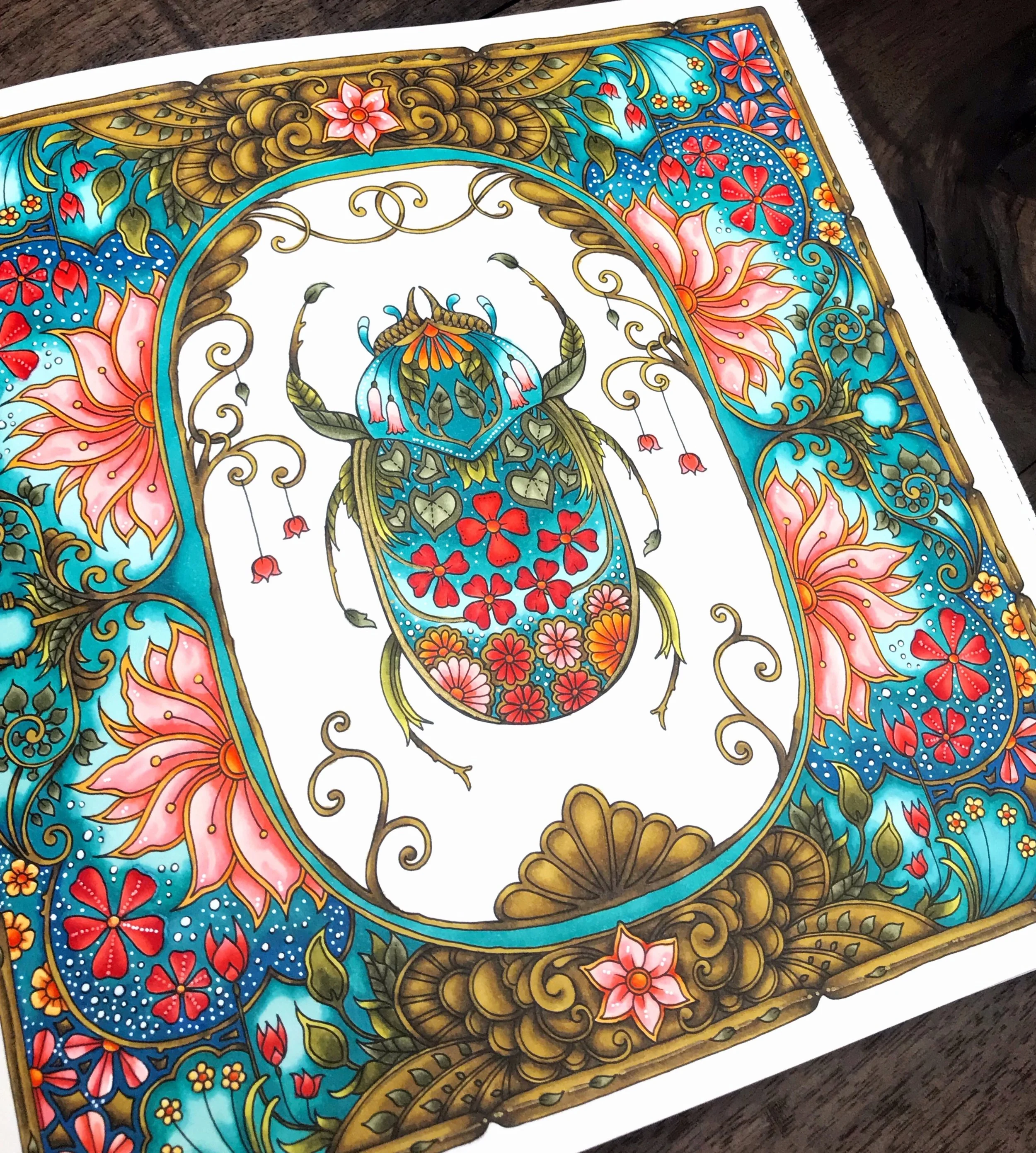

Book: World of Flowers by Johanna Basford
Supplies: Shinhan Art | Copic | Prismacolor | Faber Castell | Posca